Metal Cladding Tiles Help Airport's Design Take Flight

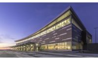
Loading docks generally aren’t known for their stylishness, but a new such structure at the Minneapolis-St. Paul International Airport is breaking with that tradition. The addition of glass curtain wall and a protective overhang clad in copper-toned metal tiles create a real visual pop in the middle of the airport’s runway area.
This loading dock was designed to solve logistics and security problems common to many major airports. Often, delivery trucks serving airport concessions and operations arrive using the same roads as passengers. Loading docks might be located within terminal structures and, in some cases, trucks might simply park alongside service doors while they’re unloading. This arrangement can create traffic backups, and it also raises obvious safety concerns if those docks are located behind security checkpoints. This new consolidated loading dock is in an isolated building between the airport’s runways that is accessed via a new roadway and tunnel.
“This is a new building type that’s trying to address increasing security concerns and the difficulty of combining traffic types,” says Philip Koski, AIA, project designer with Miller Dunwiddie, the Minneapolis architecture firm behind the facility’s design. “Only three or four similar facilities have been built nationwide, so this is on the cutting edge for airports.”
Beyond program requirements, airport officials also had design guidelines to ensure a visual connection between the new structure and others already in place. In general, these call for precast concrete construction with horizontal, corrugated metal panels finished in an aged-copper color. The Miller Dunwiddie team opted for a livelier arrangement of metal PAC-CLAD Precision Series Tiles from Petersen in a palette of three standard Kynar finishes, along with a custom Aged Copper color that matches the airport’s standards. The tiles’ cupped profile enables a unique play of light and shadow that creates a sense of movement across the face of the building’s sizable overhangs. Some 7,000 sq. ft. of the tiles were installed on the building.
“The idea was to have a range of colors that, if you stood back and squinted, it would look natural, like a green tree canopy,” Koski says.
Similar tiles have proved popular in several prominent area projects, including the Walker Library, which opened in 2014. “I can think of at least a dozen buildings with them, off the top of my head,” says Lauren Fleming, AIA, Miller Dunwiddie’s project architect for the job.
Getting the tile’s patterning right took some close coordination between the architects and installers from Otsego, Minn.-based Progressive Building Systems, according to that firm’s project manager and drafting director Dan Schwartz. It turns out that getting what appears to be a randomized color pattern isn’t as easy as throwing all the tiles up in the air to determine which one to install next.
“We try really hard to get some kind of approved drawing that shows where each color goes,” Schwartz says, explaining his company’s preferred approach to such projects. So, Schwartz ran the architects’ four selected finishes through a color-randomizer app in a back-and-forth effort to identify positioning for each installed tile. This proved especially challenging at building corners, where the design called for the tiles to appear to wrap around those bends.
“They wanted the panels on the corners to match,” Shwartz says. That might seem simple, he notes, but carrying that color around a corner forced the randomizer app to create an entirely new series. This meant that determining the final arrangement became an iterative process.
PBS also installed the overhang’s soffit – with panels featuring a unique, four-sided reveal – and fabricated their own trim for the installation.
Fleming says she worked closely with Petersen throughout the job, to both determine the best options for standard finishes that would complement the required Aged Copper color and help ensure the patterning worked according to the plans. PBS’s color-coded shop drawings were followed precisely, she says. “And when the boxes showed up on site, they just put them on in the packaged order.”
The architects recently toured the completed loading dock facility, along with airport staff, and Fleming says the project received positive reviews. What is typically a non-descript building type is, instead, a visual highlight in its between-runway location.
“It seems like the design intent for these buildings is to make them go away,” Fleming says. “And this is very noticeable, in a good way – like somebody really took care.”
Looking for a reprint of this article?
From high-res PDFs to custom plaques, order your copy today!


